Have you decided to bring new life to your clinic? What is it that you want to change? Most importantly, do you know your patients well enough to understand their needs and create the environment of care and peace that they are seeking?
We interviewed Aaron Cheng, founder and principal at C & Partners Architects in Toronto, and Lekshmy Parameswaran, partner and director of insights and strategy at fuelfor Healthcare Innovation Design and Consulting in Barcelona to get their opinions on how you can take your clinic’s design to the new heights.
C & Partners Architects is an architectural firm with offices in Toronto and Braga, Portugal, that creates innovative and forward-thinking design solutions for healthcare practitioners, focusing on patient experience and delivery of care. Their projects include but are not limited to SickKids Hospital Boomerang Centre in Vaughan, Ontario, and facility planning at St. Michael’s Hospital in Toronto. Fuelfor Healthcare Innovation Design and Consulting, with their offices in Spain and Singapore, and clients in and around Europe, has completed projects in the US and is currently helping the Singapore government transform patient experiences in their health system.
“Healthcare has such a complexity within it that it’s quite understandable people get lost somehow in that system,” Parameswaran says. “Experiences for patients, for their families and also for the staff that work in health services can be very challenging, uncomfortable and stressful. At the same time, health is a fundamental and deeply personal thing, so it really should not be this way.”
Cheng agrees saying that the healthcare design needs a special approach as it is the only type of design that caters exclusively to people who don’t feel well – who are nervous, emotional and in pain.
Many doctors willing to design or redesign their clinics are giving a lot of attention to the overall flow, layout and service quality, overlooking a number of important things. According to Parameswaran, the most common mistake that healthcare professionals usually make is designing their clinics “from inside out” – based on what they already know and what they would like to offer, rather than listening to their patients, understanding their journeys and providing a consistent quality experience.
“Satisfaction is the difference between expectation and perception: the more you meet the expectation, the more satisfied you can make someone. But you need to know what their expectations are. As a design team, we try to zoom out and understand how expectations are set.”
Parameswaran also notes that when designing a clinic, doctors sometimes forget to consider how their patients interact with the space. The reception area serves as a perfect example, she says. Oftentimes, even though the counter’s height is according to all regulations and policies, the human interaction this design detail prompts has not been considered and the patient can’t see the receptionist when they approach the counter – something fuelfor sees in different countries and health systems.
According to Cheng, many clients approach their clinics’ design the same way they would approach aesthetic changes in their homes, choosing materials or fixtures that look good at home but don’t last in the clinic. He often notices mistakes with mechanical and plumbing designs, which are not flexible enough to accommodate future changes or introduce new healthcare services as well as a poorly executed space planning, which usually results in not having enough storage. Some clients also cut corners on sound insulation between the treatment rooms, which doesn’t create that critical environment of privacy for the patients.
Fortunately, technology and modern interior design opens new opportunities for creativity and gives tons of ideas on how you can meet your patients’ expectations when it comes to your clinic’s design.
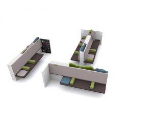
“Healthcare interior design changes along with the public perception of healthcare and the evolution of healthcare services,” says Cheng. According to him, most clinics now choose individual seating in their waiting rooms, the one that has a soft surface, is ergonomically designed, easy to clean and maintain, and doesn’t take up lots of space. “Like in other disciplines of design, the challenge is always to find some furniture that looks good, fits in our floor plans, is comfortable and of a reasonable price.”
While interior designers can work with a whole range of colours, according to Cheng, they usually avoid black and red, as they symbolize blood, danger and even death. He recommends combining them with other colours, which will allow you to create a pleasing or even luxurious environment. Appropriate colour schemes in combination with proper lighting and material textures can craft an impeccable interior design.
“Usually, we recommend a combination of colours together with different textures and proper lighting to create a warm and comfortable environment,” Cheng says. “Depending on the site condition of the medical facility (heritage building, retail level of a condominium, commercial high-rise or a typical medical building), we could have some greyish natural stone with stainless steel details and high gloss white panels, or orange red brick veneers with wood planks and painted steel to create a different effect.”
According to Cheng, interior design for treatment rooms will always depend on the doctor’s and their patients’ requirements.
“A typical family doctor treatment room, an ophthalmologist room or a pediatric exam room will have different requirements. The rule is to be creative while understanding the function of the rooms, the budget and the requirement of the health practitioners and patients.”
Parameswaran recommends stepping into your patients’ shoes, understanding your patients’ needs in context, thinking holistically of what they are going through at different stages of their healthcare journeys and translating these insights into specific design solutions that can deliver the right experience.
 “At a certain stage, you need different communication tools or service scripts, you need to rethink the way you lay out the space, you need to think about interior design elements, furniture, lighting, etc.,” Parameswaran says.
To craft a smart design strategy, she recommends determining the pain points to understand how they affect the current experience. Oftentimes, this means “shadowing the patients” – spending time with them in a clinic and accompanying them as they go through certain services, while working with staff members to determine their challenges and concerns. This will help you see where you can intervene and what changes you can make to improve the service. Parameswaran recommends working more systematically on how you design your clinic and collaborating with the people who know how the clinic functions and what it feels like on a day-to-day basis.
Parameswaran agrees that clinics should definitely focus on the capabilities and the skills of their doctors, but at the same time, zooming out and understanding the patient’s point of view will add value, differentiate the service you are offering and help you craft a clinic experience that really makes sense.
“It can make a real difference to people’s experience if there’s consideration on the interior design level because that’s the landscape in which the action happens. So if you set the scene appropriately, you can already tackle a number of anxieties, issues and pain points for people even before you begin service delivery.”


